Create Day/Night, Light/Dark or Multiple Themes in Vue.js
In this tutorial, I’m going to build a simple Vue application with two themes. We can add dynamic theme in many ways. I’m going to share a simple method by creating two themes. By this method, you can add more themes.
Before going to start, let’s have a look at the demo:
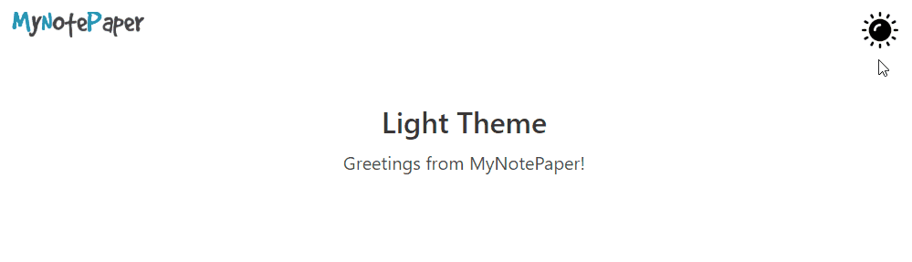
Table of Contents
- Create a Vue App
- Install SASS/SCSS Pre-Processors
- Create Two Themes
- Install Buefy (Optional)
- Create Theme Switch & Store
- Final Overview
Step 1 : Create a Vue App
You have to install Vue-CLI on your machine. If you don’t have installed yet, then install:
npm install -g @vue/cli
# OR
yarn global add @vue/cli
Now create a Vue application using this command & go to the directory:
# create app
vue create multiple-themes-in-vuejs

# go to project dir
cd multiple-themes-in-vuejs
Step 2 : Install SASS/SCSS Pre-Processors
We’re going to write our styles in the SCSS file. We need to install the SCSS/SASS loader. Let’s install the pre-processors:
npm install -D sass-loader node-sassIn the root directory of your folder, create a file called ‘webpack.config.js‘ and paste this code:
module.exports = {
    module: {
        loaders: [
            {
                test: /\.vue$/,
                loader: 'vue'
            },
            {
                test: /\.s[a|c]ss$/,
                loader: 'style!css!sass'
            }
        ]
    },
    vue: {
        loaders: {
            scss: 'style!css!sass'
        }
    }
}
Step 3 : Create Two Themes
The basic structure of theming of this tutorial:
/*
* === COLORS ===
*/
:root {
    --app-background-color: #FFFFFF;
}

[theme="dark"] {
    --app-background-color: #091A28;
}

[theme="sepia"] {
    --app-background-color: #F1E7D0;
}

/*
* === STYLES ===
*/
.app-background {
  background-color: var(--app-background-color);
}
In the example, I’ve created 3 themes.
:rootis the default theme. We can call this light/day mode.[theme="dark"]is the theme named dark.[theme="sepia"]is the theme named sepia.
In this tutorial, I’m going to create two themes called day/light (:root default) and another is night/dark theme. Let’s create:
Navigate to src/assets folder and create a folder named css. Then go to the css folder and make two files called ‘styles.scss‘ and ‘theme-colors.scss‘.
In the ‘theme-colors.scss‘ file, we’ll keep colors and in the ‘styles.scss‘ file, we’ll design.
Open the theme-colors.scss file and paste this code:
:root {
    --app-background-color: #FFFFFF;
    --dynamic-title-color: #363636;
    --dynamic-subtitle-color: #4a4a4a;
}

[theme="dark"] {
    --app-background-color: #091A28;
    --dynamic-title-color: #FFFFFF;
    --dynamic-subtitle-color: cyan;
}
Now open styles.scss. At first, we’ll import the theme-colors.scss file in styles.css.
@import 'theme-colors';

/*
* === BODY, APP BACKGROUND ETC. ===
*/
html, body {
  height: 100%;
}

.container {
  max-width: 1040px;
}

.app-background {
  background-color: var(--app-background-color);
}

.dynamic-title {
  color: var(--dynamic-title-color);
}

.dynamic-subtitle {
  color: var(--dynamic-subtitle-color);
  padding-top: 10px;
}

/*
* === THEME SWITCH ===
*/
input.theme-switch {
  display: none;
}

input.theme-switch + label {
  cursor: pointer;
}

input.theme-switch:not(:checked) + label:hover {
  cursor: pointer;
}

input.theme-switch + label:active,
input.theme-switch:checked + label {
  cursor: pointer;
}
I’ve written some styles for our application. You’ll write your own styles like me.
The last thing, we need to import the CSS in the src/main.js file. Lets’ do this:
// custom styles
import './assets/css/styles.scss'
Our theming part is done.
Step 4 : Install Buefy (Optional)
This step is optional. I’m going to install Buefy (Lightweight UI components for Vue.js based on Bulma) to design our application shortly.
# install
npm install buefy

# import to main.js
import Buefy from 'buefy'
import 'buefy/dist/buefy.css'

Vue.use(Buefy)
Step 5 : Create Theme Switch & Store
I’m going to create a simple UI using Buefy in App.vue file. We’ll store selected theme in local using localStorage.
We’ll take a checkbox for switching theme, will create a v-model to watch on switching. I hope you have the idea about data(), mounted() and watch.
Open App.vue file, and take a checkbox & create v-model named darkMode:
<input type="checkbox" class='theme-switch' v-model="darkMode"/>To identify switch change, we need to add the watch method. Let’s do this:
data() {
    return {
        darkMode: false,
    }
},
mounted() {
    // set 'app-background' class to body
    let bodyElement = document.body;
    bodyElement.classList.add("app-background");
},
watch: {
    darkMode: function () {
        // add/remove class to/from html tag
        let htmlElement = document.documentElement;

        if (this.darkMode) {
            localStorage.setItem("theme", 'dark');
            htmlElement.setAttribute('theme', 'dark');
        } else {
            localStorage.setItem("theme", 'light');
            htmlElement.setAttribute('theme', 'light');
        }
    }
}
Now on changing switch, the theme will change. We’ve stored the selected theme name in local storage. To display the selected theme, we need to set condition in mounted() method like this:
mounted() {
    // check for active theme
    let htmlElement = document.documentElement;
    let theme = localStorage.getItem("theme");

    if (theme === 'dark') {
        htmlElement.setAttribute('theme', 'dark')
        this.darkMode = true
    } else {
        htmlElement.setAttribute('theme', 'light');
        this.darkMode = false
    }
},
Our theming is done. ?
Step 6 : Final Overview
We’ve created light and dark theme. Let’s take a look at the main.js file:
import Vue from 'vue'
import App from './App.vue'

Vue.config.productionTip = false

// beufy
import Buefy from 'buefy'
import 'buefy/dist/buefy.css'

// custom styles
import './assets/css/styles.scss'

Vue.use(Buefy)

new Vue({
    render: h => h(App),
}).$mount('#app')
and the App.vue looks like:
<template>
    <div id="app">
        <div class="section container">

            <div class="columns is-mobile">
                <div class="column is-2">
                    <!-- dynamic logo -->
                    <a href="https://shouts.dev/" target="_blank">
                        <span v-if="darkMode === true">
                            <img alt="logo" src="./assets/images/logo-white.png">
                        </span>
                        <span v-else>
                            <img alt="logo" src="./assets/images/logo-black.png">
                        </span>
                    </a>
                </div>
                <div class="column is-9">
                    <!-- content -->
                </div>
                <div class="column is-1">
                    <!-- theme switcher -->
                    <input type="checkbox" id='theme-switch' class='theme-switch' v-model="darkMode"/>
                    <label for='theme-switch'>
                        <span v-if="darkMode === true">
                            <img alt="logo" src="./assets/images/sun.png" width="40">
                        </span>
                        <span v-else>
                            <img alt="logo" src="./assets/images/moon.png" width="40">
                        </span>
                    </label>
                </div>
            </div>

            <section class="hero is-medium has-text-centered">
                <div class="hero-body">
                    <div class="container">
                        <h1 class="title dynamic-title">
                            <span v-if="darkMode === true">Dark Theme</span>
                            <span v-else>Light Theme</span>
                        </h1>
                        <h2 class="subtitle dynamic-subtitle">Greetings from MyNotePaper!</h2>
                    </div>
                </div>
            </section>

        </div>

    </div>
</template>

<script>
    export default {
        name: 'app',
        data() {
            return {
                darkMode: false,
            }
        },
        mounted() {
            // set page title
            document.title = 'Multiple Themes in Vue.js';

            // set 'app-background' class to body tag
            let bodyElement = document.body;
            bodyElement.classList.add("app-background");

            // check for active theme
            let htmlElement = document.documentElement;
            let theme = localStorage.getItem("theme");

            if (theme === 'dark') {
                htmlElement.setAttribute('theme', 'dark')
                this.darkMode = true
            } else {
                htmlElement.setAttribute('theme', 'light');
                this.darkMode = false
            }
        },
        watch: {
            darkMode: function () {
                // add/remove class to/from html tag
                let htmlElement = document.documentElement;

                if (this.darkMode) {
                    localStorage.setItem("theme", 'dark');
                    htmlElement.setAttribute('theme', 'dark');
                } else {
                    localStorage.setItem("theme", 'light');
                    htmlElement.setAttribute('theme', 'light');
                }
            }
        }
    }
</script>
Note: I’ve used some images in this project. These are stored in src/assets/images folder. You may take the images from my GitHub repository or replace these with yours. Otherwise, you may see errors for these images.
Now run the application and enjoy:
npm run serveThe tutorial is over. You can download this project from GitHub. Thank you.
Md Obydullah
Software Engineer | Ethical Hacker & Cybersecurity...
Md Obydullah is a software engineer and full stack developer specialist at Laravel, Django, Vue.js, Node.js, Android, Linux Server, and Ethichal Hacking.